RoosRoast

Overview
RoosRoast Coffee, a beloved Ann Arbor staple with two locations and a growing presence in local grocery stores, has seen a steady rise in e-commerce through their website, roosroast.com. While their current site performs well, they are eager to enhance the user experience. My team and I are redesigning their website for both mobile and desktop, leveraging their existing resources to craft a unique and engaging storytelling experience.
Duration
Team
Skills
Wenxi Wang & Joy Huang
01 - 03/2024
User Research, Competitive Analysis, Card Sorting, Wireframing, Prototyping,


From an avid coffee lover’s dream
to a vibrant reality.
RoosRoast Coffee began as the creative vision of John Roos, a lifelong Ann Arbor local with a talent for blending art, food, and community. From his days as a skateboarder and chef to his adventures in bohemian subcultures, John developed a unique perspective and a refined palate that now defines RoosRoast’s exceptional coffee, where every cup tells a story.
Competitive Review
When users can't see the full order cost in their shopping cart, it can cause frustration and mistrust. Unexpected charges like taxes, shipping, or handling fees appearing only at checkout may surprise customers, leading them to reconsider their purchase.

Competitive review on e-commerce website shopping carts.
In- Store Experience


Our class took a field trip to the RoosRoast store, where we met the team and gained insight into their brand, culture, and operations.
Identifying Problems


Website Analysis
Current Website Issues:
Poor hierarchy and organization of navigation tabs.
Lack of emphasis on the subscription service, a key profit source.
Missed opportunity to convey personality, community value, and quality.
Difficulty replicating the in-person RoosRoast experience online.
Questions Considered:
Which UX laws are violated (e.g., via Baymard Research)?
How to enhance scrolling engagement (aesthetic usability)?
What interface improvements boost e-commerce performance?
Key Focus Areas:
Home page
Product page
Shopping cart

User experience flow chart

Navigation bar card sorting
Sketch
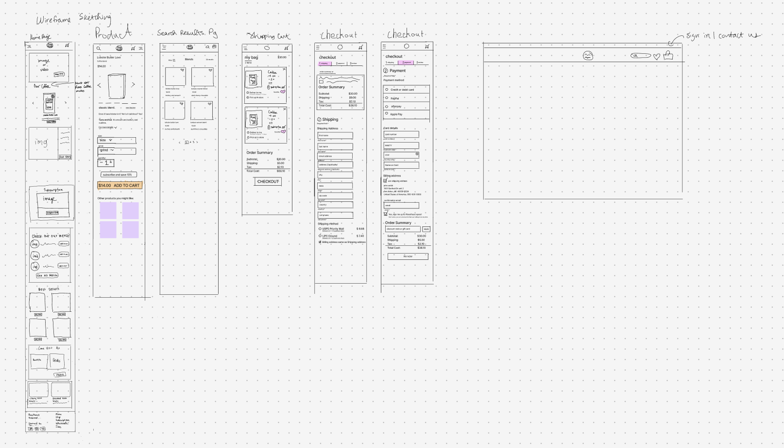
We began with a general low-fidelity wireframe sketch of the website to focus on structure, user flow, and information hierarchy without being distracted by visual details.
This approach allowed us to quickly identify potential usability issues, encourage collaboration, and refine the layout before investing time in detailed design.
Key Design Decisions
-
1. First Impression
We wanted to create a unique RoosRoast style and prioritized flow for the Home Page, as it is the most important page that catches user’s attention.
Through adding John Roos’s sketches and prioritizing sections (“about us”, “subscription”, “best sellers”) it helped emphasize RoosRoast’s character in terms of their customer relations and e-commerce needs. -
2. Subscription
We decided to create a separate subscription page on the navigation menu bar based off our competitive reviews research.
Along with an option on the product page to choose subscription, we added it to the shopping cart to provide easy access and control for subscriptions.
With only one subscription button option, the default option is a quick process for user. -
3. Smooth Checkout
To ensure customers do not spend too much time on the checkout process, we minimized and divided the checkout forms into sections for better organization purposes.
By asking for the zip code in the shopping bag delivery method, it allows the customers to view the estimated shipping cost immediately. The total order summary will be displayed throughout entire checkout process.
Design
Wireframes