Nook
Prototype Project of a Study Spot Finder
Project Objective:
Develop a user-friendly digital platform that provides real-time availability, detailed information, and navigation for on-campus study spots, helping students save time, avoid overcrowding, and optimize their study experience based on occupancy levels, amenities, and user preferences.
Duration:
01 - 03/2025
Skills:
Design Systems, Wireframing, Prototyping, User Research, Usability Testing, User Surveys

The Problem
University of Michigan students want an app to efficiently find study spots that match their preferences so they can save time and study comfortably.
Assumptions
Before I started designing, I thought that students mainly struggled with finding study spots due to a lack of information about available locations on campus. I assumed that providing a simple list of study spots with basic occupancy information would be enough to meet users' needs. I expected users to prioritize convenience and choose study spots based on proximity alone. I didn't realize how important real-time availability, detailed information (like ratings and photos), and navigation features were until I learned from my interviews and started designing. These insights showed that users value accuracy, ease of access, and a seamless experience when selecting and navigating to study spots.
Research
I conducted interviews with 4 univeristy of michigan students and asked them about their normal studying routine.
Difficulty finding available spots – Many spaces are overcrowded, especially during peak hours (afternoons, finals season).
Time wasted searching – Students spend excessive energy wandering to find open spots, often defaulting to the same locations.
Limited visibility of amenities – Lack of info on outlets, seating types, lighting, food/drinks, or building hours.
Unpredictable busyness – No way to gauge real-time occupancy before arriving.
Environmental discomfort – Some dislike overly quiet libraries, while others need quiet spaces.
Pain Points
Where they study:
Cafés (for vibes, food/drinks, background noise).
Libraries (if quiet and not overcrowded, e.g., Hatcher 4th floor).
Home (for convenience, but distractions are an issue).
When they study:
Afternoons between classes or late at night (post-2 PM to midnight).
Key environmental preferences:
Lighting: Natural/warm lighting preferred (harsh lighting is disliked).
Noise level: Moderate background noise (e.g., cafés) or quiet (for focus).
Amenities: Outlets, bathrooms, food/drinks, seating variety (tables, private rooms).
Habits & Preferences
Real-time occupancy data – Percentage-based busyness indicators (like dining hall apps) or exact seat counts.
Filterable search – By proximity, noise level, amenities (outlets, food), seating type, and building hours.
Navigation integration – Directions to available spots to reduce time spent searching.
User-generated insights – Photos, ratings, and crowd-sourced updates (e.g., "busier than usual").
Personalization – Save favorite spots or get recommendations based on historical preferences.
Core Needs
Students need a centralized tool to reduce uncertainty and streamline decision-making when choosing study spots, balancing real-time data with personalized preferences.
Key Takeaway
User Personas

Site Map
To visualize and map out the information hierarchy and design flow, a sitemap was created.

Design System
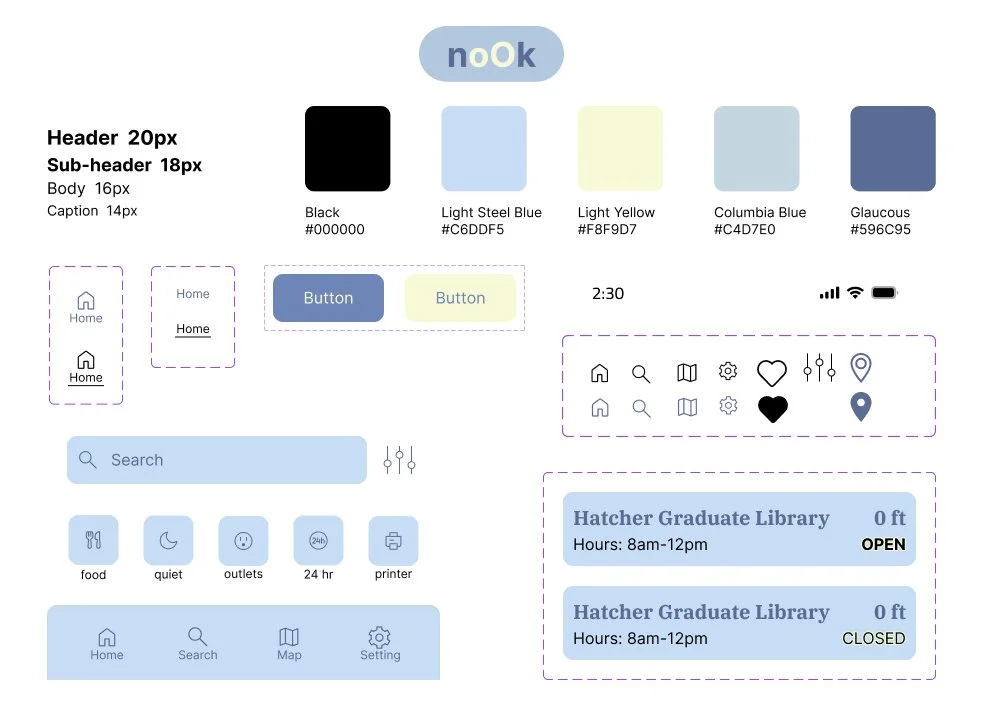
The interface adopts a pastel reinterpretation of the University of Michigan’s brand colors, creating a visually soothing and approachable aesthetic. The muted tones reduce eye strain during prolonged use while maintaining subtle school spirit.
Wireframe Iterations
Initial Sketch: I sketched out 3 different product features using the 9 ideation sketch method

Lo-fi Wireframes


Hi-fi Wireframes

Interactive Prototype