
MSU Libraries Mobile App
MSU Libraries
Mobile App
MSU Libraries Mobile App
Everything the library offers, one tap away.
Everything the library offers, one tap away.
Everything the library offers, one tap away.
#product design #mobile app
#product design #mobile app
#product design #mobile app
A project redesigning how MSU students access library resources on mobile. Through user research and iterative design, we built a full high-fidelity prototype that brought essential library features to students' smartphones, validated through usability testing.
A project redesigning how MSU students access library resources on mobile. Through user research and iterative design, we built a full high-fidelity prototype that brought essential library features to students’ smartphones, validated through usability testing.
Role
Role
UX Designer + Researcher
UX Designer + Researcher
Year
Year
2025-2026
2025-2026
Client
Client
Michigan State University Libraries
Michigan State University Libraries
Skills
Skills
Figma/Qualtrics/Cross-functional Teams
Figma/Qualtrics/Cross-functional Teams
Problem
Problem
You can’t use a resource you don’t know the library has.
You can’t use a resource you don’t know the library has.
You can’t use a resource you don’t know the library has.
MSU Libraries supports students, faculty, staff, and the Lansing community, but many users don’t know the full range of what’s available, from research help to checkouts to study spaces. That gap widens when they step away from a desktop, where finding information is harder and a reliable mobile experience doesn’t exist. People miss updates, struggle to find what they need, and can’t manage their checkouts on the go. That’s the gap we set out to close.
MSU Libraries supports students, faculty, staff, and the Lansing community, but many users don’t know the full range of what’s available, from research help to checkouts to study spaces. That gap widens when they step away from a desktop, where finding information is harder and a reliable mobile experience doesn’t exist. People miss updates, struggle to find what they need, and can’t manage their checkouts on the go. That’s the gap we set out to close.
Research
Research
We looked at what already works, and where it falls short.
We looked at what already works, and where it falls short.
We looked at what already works, and where it falls short.

To understand how other libraries bring their resources to mobile, we analyzed three comparator apps: Brown University’s moBUL, the Ex Libris platform, and Libby. Each handles part of the experience well, but none fully solves the problem of helping users discover what’s available and manage it in one place. Their strengths and gaps shaped the direction of our design.
To understand how other libraries bring their resources to mobile, we analyzed three comparator apps: Brown University’s moBUL, the Ex Libris platform, and Libby. Each handles part of the experience well, but none fully solves the problem of helping users discover what’s available and manage it in one place. Their strengths and gaps shaped the direction of our design.
Screening Survey Findings
Screening Survey Findings
Screening Survey Findings

Our survey showed that students mainly use MSU Libraries as a study space and research resource. Awareness of other services, like events, was low, revealing a gap between what the library offers and what students recognize.
Our survey showed that students mainly use MSU Libraries as a study space and research resource. Awareness of other services, like events, was low, revealing a gap between what the library offers and what students recognize.
To dig deeper, we built an interview guide to learn how students discover library services, what holds them back from using more, and which interactions matter most on mobile.
To dig deeper, we built an interview guide to learn how students discover library services, what holds them back from using more, and which interactions matter most on mobile.
We talked to 14 people to understand how they actually experience the library.
We talked to 14 people to understand how they actually experience the library.
We talked to 14 people to understand how they actually experience the library.

From the affinity maps, the team was able to code the gathered quotes into current usage patterns, issues and concerns, and wishes for a mobile application.
From the affinity maps, the team was able to code the gathered quotes into current usage patterns, issues and concerns, and wishes for a mobile application.

This quote stood out to me.
This quote stood out to me.
What we learned: Students use the library for what they already know about, whether that’s studying, printing, or searching for readings. Everything else goes unnoticed, so the app needed to help students discover it.
What we learned: Students use the library for what they already know about, whether that’s studying, printing, or searching for readings. Everything else goes unnoticed, so the app needed to help students discover it.
Personas
Personas
Personas
We designed around three people: two students with very different needs, and a librarian who helps them every day.
We designed around three people: two students with very different needs, and a librarian who helps them every day.

Turner, the Task-Driven Student
Turner, the Task-Driven Student
Turner, the Task-Driven Student
Turner is a junior studying chemistry who uses the library mainly as a quiet place to study and for quick research. With a packed schedule, he only visits when it feels worth the trip, and he rarely explores beyond what a class requires. He’s frustrated by the number of separate MSU apps he has to juggle and doesn’t know most of what the library offers. He needs a fast, clear way to finish tasks and find available study space.
Turner is a junior studying chemistry who uses the library mainly as a quiet place to study and for quick research. With a packed schedule, he only visits when it feels worth the trip, and he rarely explores beyond what a class requires. He’s frustrated by the number of separate MSU apps he has to juggle and doesn’t know most of what the library offers. He needs a fast, clear way to finish tasks and find available study space.
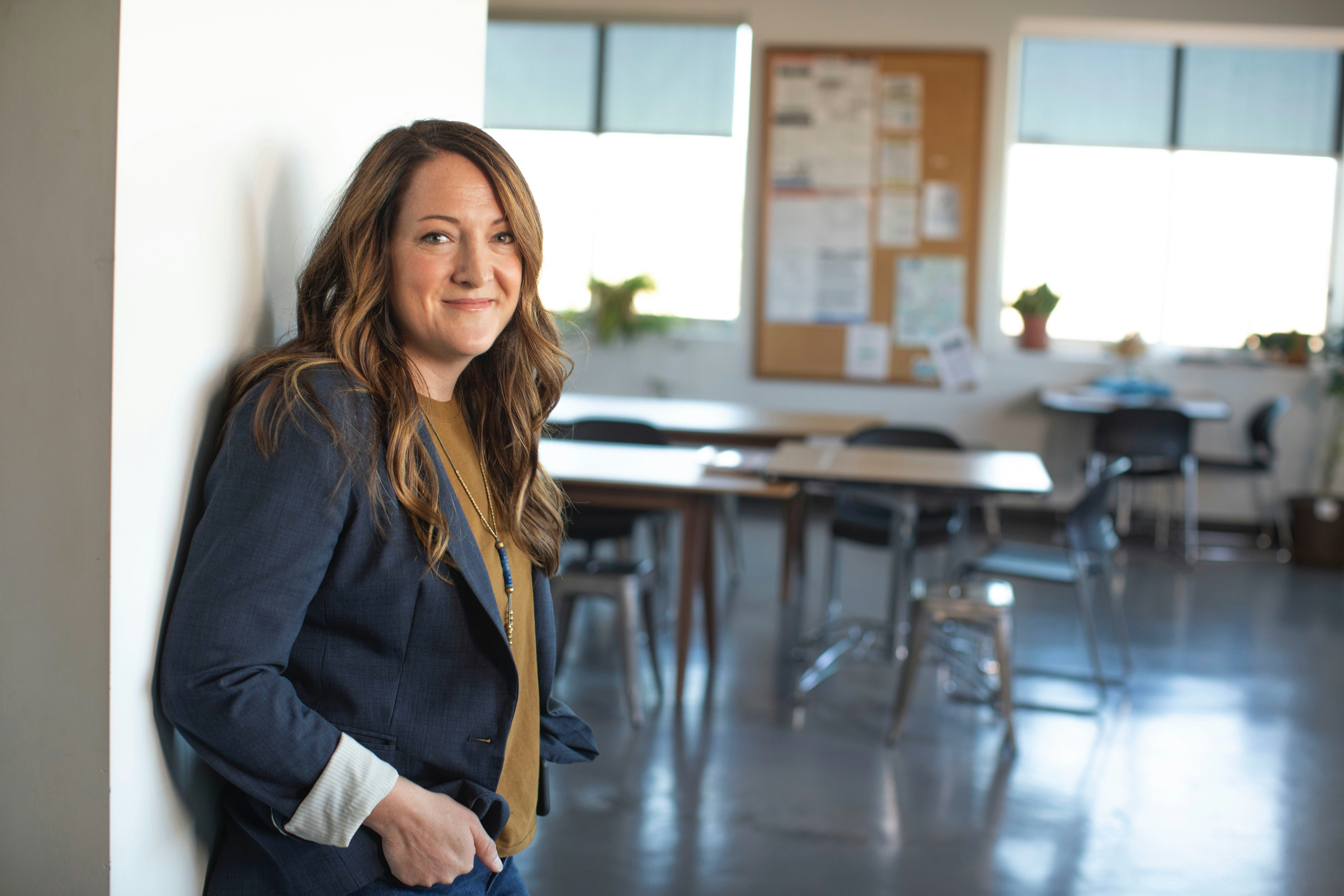
Angela, the Experienced Librarian
Angela, the Experienced Librarian
Angela, the Experienced Librarian
Angela has worked at MSU Libraries for 14 years and spends her days helping students and colleagues find resources. She sees users get stuck on confusing library terms, cluttered search results, and a disconnect between online listings and physical locations. She needs a clear FAQ, search results that point to where items are in the building, and mobile tools students can use inside the library, so they can help themselves and she can spend less time on basic questions.
Angela has worked at MSU Libraries for 14 years and spends her days helping students and colleagues find resources. She sees users get stuck on confusing library terms, cluttered search results, and a disconnect between online listings and physical locations. She needs a clear FAQ, search results that point to where items are in the building, and mobile tools students can use inside the library, so they can help themselves and she can spend less time on basic questions.

Jordan, the Research-Savvy Student
Jordan, the Research-Savvy Student
Jordan, the Research-Savvy Student
Jordan is a senior double majoring in Political Science and Sociology who relies on the library for archives, databases, and librarian consultations. The library’s terminology made getting started hard, and switching between systems costs them time. Jordan needs reliable access to materials from anywhere and a simple way to find credible sources without repeating work.
Jordan is a senior double majoring in Political Science and Sociology who relies on the library for archives, databases, and librarian consultations. The library’s terminology made getting started hard, and switching between systems costs them time. Jordan needs reliable access to materials from anywhere and a simple way to find credible sources without repeating work.
Design Requirements
Design Requirements
What features we prioritized.
What features we prioritized.
What features we prioritized.
Our design process was directly informed by the research phase. The requirements we established drove every structural and interaction decision in the app. We moved through four stages: sketching, low-fidelity wireframing, high-fidelity design, and interactive prototyping, with continuous iteration based on peer and client feedback at each stage.
Our design process was directly informed by the research phase. The requirements we established drove every structural and interaction decision in the app. We moved through four stages: sketching, low-fidelity wireframing, high-fidelity design, and interactive prototyping, with continuous iteration based on peer and client feedback at each stage.

Evaluation
Evaluation
We tested twice. Task completion went from 60% to 100%.
We tested twice. Task completion went from 60% to 100%.
We tested twice. Task completion went from 60% to 100%.
To check that the prototype worked, we ran two rounds of moderated usability testing. Both rounds used the same five tasks: booking a room, registering for an event, finding study spaces in the directory, placing a hold on a book, and checking account status.
To check that the prototype worked, we ran two rounds of moderated usability testing. Both rounds used the same five tasks: booking a room, registering for an event, finding study spaces in the directory, placing a hold on a book, and checking account status.

Phase 1: In the library
Phase 1: In the library
Phase 1: In the library
We tested at the MSU Main Library, where students actually use the space. People could complete core flows like booking a room and placing a hold, but tasks that depended on navigation and labels were harder. Users weren’t sure where to start, misread interface elements, and used the map in ways we didn’t intend.
We tested at the MSU Main Library, where students actually use the space. People could complete core flows like booking a room and placing a hold, but tasks that depended on navigation and labels were harder. Users weren’t sure where to start, misread interface elements, and used the map in ways we didn’t intend.
Phase 2: Online
Phase 2: Online
Phase 2: Online
We ran the same tasks with the updated prototype. Every participant completed every task, with zero task failures. The small issues that remained, like expecting a profile in the nav bar, pointed to labeling as the next thing to refine.
We ran the same tasks with the updated prototype. Every participant completed every task, with zero task failures. The small issues that remained, like expecting a profile in the nav bar, pointed to labeling as the next thing to refine.
Designs
Designs
Final Design After Revision
Final Design After Revision
Final Design After Revision


Lesson
Lesson
What I learned.
What I learned.
What I learned.
Access isn’t enough if people don’t know what exists.
One participant told us, “I don’t know what I don’t know.” That changed how I thought about the problem. Making things easy to find only helps if users know to look, so the design also had to show them what the library offers.
Access isn’t enough if people don’t know what exists.
One participant told us, “I don’t know what I don’t know.” That changed how I thought about the problem. Making things easy to find only helps if users know to look, so the design also had to show them what the library offers.
Testing in the real setting shows what a screen can’t.
Running Phase 1 inside the library exposed problems we wouldn’t have caught otherwise, like students reading the map as proof their study room was booked. Seeing where people actually hesitate taught me to watch behavior, not just listen to what users say.
Finishing a task doesn’t mean the design is clear.
Some tasks scored 5/5 and still needed changes, because users were unsure about things like pickup times or what “My Library” meant. Small wording choices, like “Main Floor” vs. “First Floor,” changed whether people felt confident.
Finishing a task doesn’t mean the design is clear.
Some tasks scored 5/5 and still needed changes, because users were unsure about things like pickup times or what “My Library” meant. Small wording choices, like “Main Floor” vs. “First Floor,” changed whether people felt confident.
This was a fun project, and I’m grateful for my team (Lauren, Emily, Lia and Dani) and for the MSU Libraries developers, UX designers, and librarians who supported us along the way!
This was a fun project, and I’m grateful for my team (Lauren, Emily, Lia and Dani) and for the MSU Libraries developers, UX designers, and librarians who supported us along the way!
This was a fun project, and I’m grateful for my team (Lauren, Emily, Lia and Dani) and for the MSU Libraries developers, UX designers, and librarians who supported us along the way!